Why We Publish Raw Windows
Search-marketing results are usually presented as a single triumphant screenshot: an up-and-to-the-right curve with the axes cropped and the dates trimmed. We build software that makes claims about search performance on our clients' behalf, so we hold ourselves to the standard we wrote into that software: every number names its window, its source, and its direction of error. Internally we call the discipline honesty engineering: floors that can only understate, sampled metrics labeled as samples, and windows pinned to every rolling figure. This note applies the same contract to our own founding data.
The two properties below are anonymized by editorial policy, not because the data is fragile. Site A is a high-traffic current-events tracking property the studio operates. Site B is a local service client in southern New Hampshire enrolled in our autonomous content and local-ranking pipeline. Everything shown comes from Google Search Console's Performance report over the 16-month range, captured August 14, 2026, aggregated by ISO week with partial trailing weeks dropped rather than extrapolated.[1]
Measurement Method
Growth multiples are notoriously easy to inflate: select a quiet day as the baseline, select the best week as the endpoint, and divide. To keep the comparison honest, we compare fixed 28-day windows (the first 28 days a property has Search Console data against the most recent 28 complete days) and report the ratio of daily averages. Twenty-eight days absorbs day-of-week effects; using the property's first data on record denies us a flattering start point; using the latest complete window denies us a cherry-picked peak.
- Impressions is the primary series: it measures how often Google chose to surface the property, which is the closest Search Console gets to "earned visibility."
- Clicks are reported but not headlined: they entangle visibility with snippet quality and intent, which deserve their own analysis.
- Weekly aggregation is used for charts, and daily averages are used for window comparisons. No smoothing or outlier removal is applied; event spikes remain in the data and are discussed rather than hidden.
Site A: A 17x Curve
Site A recorded its first Search Console data in mid-February 2026. Over its first 28 days it averaged 122.8 impressions per day. Over the most recent 28 complete days it averaged 2,102, a 17.1x multiple. The shorthand claim of "more than 12x" rests on this measurement, stated conservatively.[1]
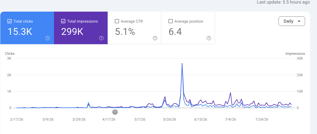
Two features of this curve deserve scrutiny rather than celebration. First, the tallest spikes are demand events: Site A tracks a current-events topic, and when the news cycle surges, impressions surge with it regardless of anything we shipped. Second, the honest signal is the floor, not the peaks: the quiet-week baseline moved from roughly a thousand weekly impressions in early spring to the mid-teens-of-thousands by summer and stayed there through quiet cycles. Elevated floors survive news lulls; spikes do not.
Site B: The Flat Curve We Publish Anyway
Site B is the deliberate counter-example. It is a young local service business whose site entered Search Console in mid-April 2026. It reached roughly 7,000–8,000 monthly impressions within its first six weeks and then held that level. April (from the 19th): 1,520. May: 7,271. June: 8,188. July: 7,160. If we applied the same window arithmetic we used for Site A, we could advertise the April-to-May jump as "4.7x growth in a month." We do not, because the honest description is different: a small local site reached its demand ceiling quickly, and after that the impressions series measures the size of the local market more than the quality of the work.[1]
For a business like this, the metrics that move revenue are local: whether the business appears in the map results a customer actually sees from their own neighborhood, and at what position. This is why our platform runs geographic grid scans for local clients: a 7x7 measurement grid across a five-kilometer radius around the business, with each cell querying local results as a customer at that location would see them. In Site B's third full scan, all 49 cells completed; the business appeared in local results in 8.2% of cells, at an average position of 1.5 where it appeared.[3] That 8.2% is the number the flat impressions curve was hiding: near-total dominance in the immediate service area, near-zero visibility beyond it. This is a map-coverage problem with a known playbook, not a content problem.
Why publish a flat curve?
What Actually Moved the Curves
Both properties run on the autonomous SEO platform we build inside Zyan, our software arm; the same system is documented across this research index. The relevant interventions, drawn from the platform's own run ledgers, are as follows:[2]
- Continuous technical remediation. Automated audit collectors feed a deterministic recommendations engine; approved fixes are applied by supervised agents and re-verified against the live site.
- A guarded content pipeline. Topic research, drafting, and publication run as scheduled autonomous work with hard fences (protected paths, execution bans, verification on every change) and human release lanes for anything held.
- Honest reporting loops. Every claim the platform makes to a client (indexed pages, ranking movement, traffic windows) passes through the honesty-engineering rules that this note also follows.
- For local clients, grid-based rank measurement in place of vanity impressions, per Site B above.
We resist attributing a specific percentage of Site A's growth to the platform. The property benefits from real news demand we do not control; the platform's contribution is the elevated baseline (reliable presence when demand arrives) and the compounding page inventory that captures it. Attribution beyond that would be the kind of claim our own reporting rules would flag.
Why This Data Matters for AI Search
Search is splitting into two consumers: human readers arriving from result pages, and AI systems (answer engines, assistants, and agentic browsers) that read, summarize, and cite. Our working thesis is that the disciplines are converging: the same structured honesty that makes a report trustworthy to a client (named windows, labeled samples, floors that understate) is what makes a page legible and citable to a machine. The founding data here is the baseline for that program. Impressions curves measure the old channel; the measurement systems we are building next, including how autonomous agents read, modify, and verify a website's content safely, are documented in the companion write-ups in this index.
Limitations
- Two properties constitute founding data, not a study. We publish it to establish the measurement contract, and we will extend the series as more properties accumulate clean windows.
- Site A’s vertical is demand-volatile; its multiple would be smaller measured floor-to-floor (roughly 1K to 12–15K weekly, still >10x) and larger measured peak-to-trough. We publish the window arithmetic precisely so readers can recompute.
- Impressions are a visibility proxy, not revenue. Site B’s flat impressions with 8.2% grid share and position 1.5 in-area indicate a healthier local business than many rising curves.
- Search Console data is subject to Google’s own sampling and privacy thresholds; we treat it as the best available public-instrument record, not ground truth.