Clement Heck Photography
A portfolio site for a working photographer — where the imagery is the design, the booking is the CTA, and the page weight never betrays the print-quality source.

How the new portfolio is pulling its weight.
A photographer's portfolio is a weird web problem. The work has to be print-quality — gradients that don't band, skin tones that don't posterize, blacks that actually look black — but the page still has to load before the prospect taps away.
We rebuilt Clement's site around that tension: a minimalist shell that gets out of the way, progressive WebP imagery that hands off to full-res only on lightbox open, and a Calendly integration so the sales conversation starts with "when," not "how much."
- Displaying print-ready imagery without crushing mobile load time.
- Galleries that highlight the photos without the UI stealing attention.
- A booking flow that matches how he actually schedules sessions.
- Standing out in a saturated New England photography market.
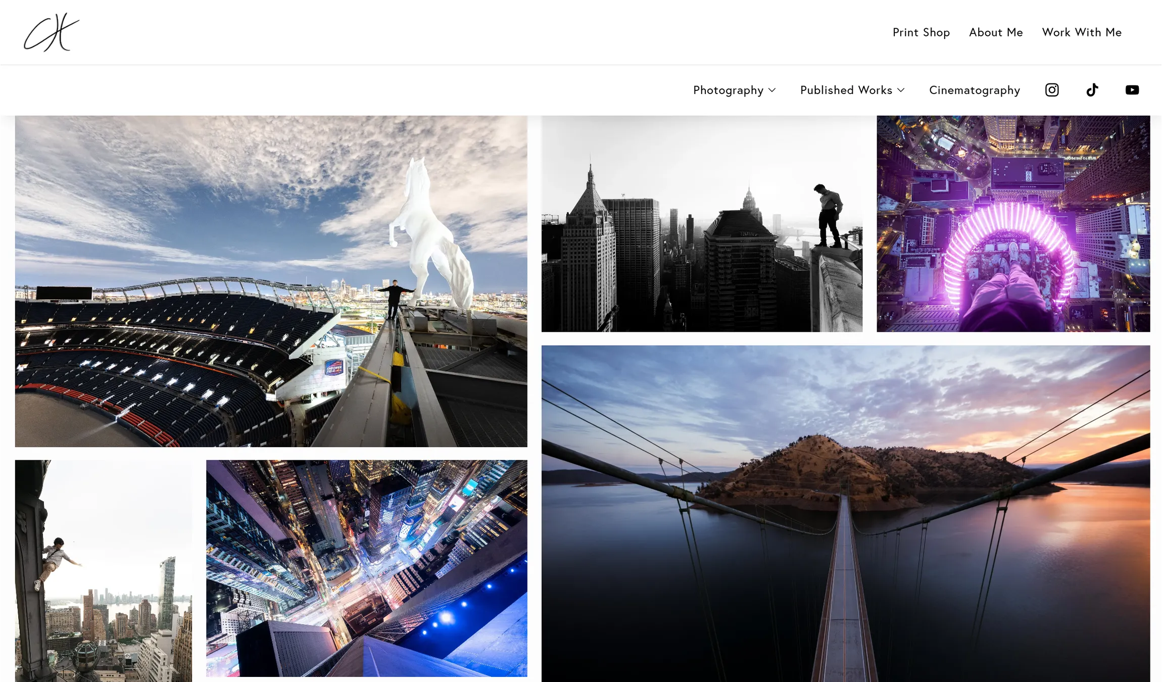
- Progressive image pipeline — AVIF first, WebP fallback, full-res only on lightbox open.
- Minimalist gallery layouts with generous negative space and subtle film-grain transitions.
- Calendly embed with custom styling so the brand holds through the booking flow.
- Elegant type pairing (serif titling + sans body) that signals "studio" without being precious.
The three screens that had to earn their weight: the homepage that stops the scroll, the gallery that holds attention, and the booking flow that closes — rendered from the live site, no mockups, no placeholders.
The site captures exactly what my work looks like in person — nothing crushed, nothing oversaturated. And the booking flow is so clean I barely answer scheduling emails anymore.
Want something like this?
Let's talk about what a bespoke build would look like for your business.